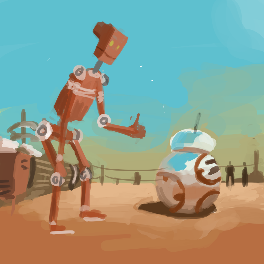
Goro fujita 30 minutes challenge, instead of painting from the imagination it’s a master study.

One benefit of this is quickly geting in the information. This really benefited me because if i had had it my way it would have taken more than an hour

Goro fujita 30 minutes challenge, instead of painting from the imagination it’s a master study.
One benefit of this is quickly geting in the information. This really benefited me because if i had had it my way it would have taken more than an hour
Goro fujita does a 30 minute painting to practice his painting.

Out of all the three this one was by far the worst one I did. I struggled to paint this, it’s probably because of the paint I had. For this I used acrylic, the acrylic paint set I used had the basic set of colours blue, yellow, red, black, white and brown. This alone wasn’t the thing that made this aggravating, what made it so was the mixing of colours. So every time I ran out of the colour green I would have to make another batch there for making a different green.
Another problem i end up facing was drawing the the image. I could never draw it right cause a lot more confusion and frustration. Maybe if I used a different paint like water colour it would have been easier.

I wanted to redo it again with this one but I gut frustrated and left it.

My first attempt didn’t go well I got frustrated with it because I couldn’t get the lighting correctly. Plus the sketch behind it was rough so it was hard to tell what was what.
I did this in 30mins.

My second attempted was better than the first but the only problem what that it was meant to be a test run for me to figure out the dark and light values. I end up spending a lot longer with about an 1 hour. With it i was a lot more relaxed and confident moving on to make a larger one.

My third attempt was by far the beast with the help of the second attempt i was looking more closely to the reference image than I did with the first attempt. By far the biggest challenge was to get the anatomy right. That’s because In every recreation i have struggled to get sword hand right. The arm is always longer than the other but other than that it was very swell.


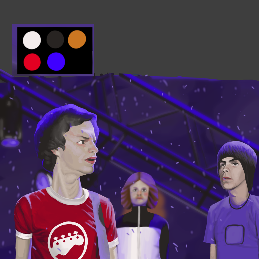
I decided to redo the entire Zorn palette work, the old one was a bit wrought around the edges and that’s why I decided to redo it. Another reason why I need to redo this was because the last ones background was really shitty.
The shirts rankles was a bit difficult form me to recreate that is why isn’t all that great.
The Zorn plate was kind annoying to use that’s because of the electric blue rim light and the dude to the right shirt. For the life of me I couldn’t recreate the color, and because of that it did fill right.
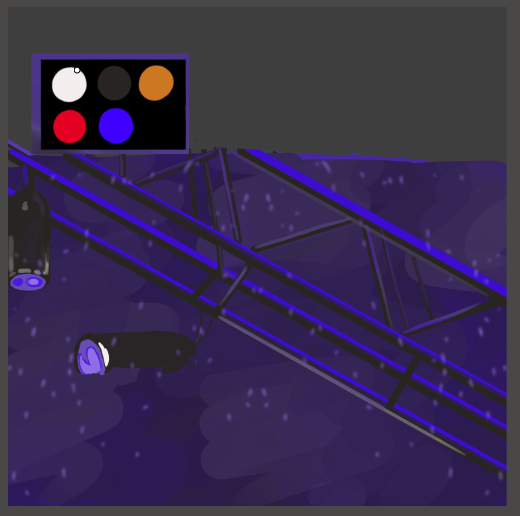
For the last one I want in the mode to complete it

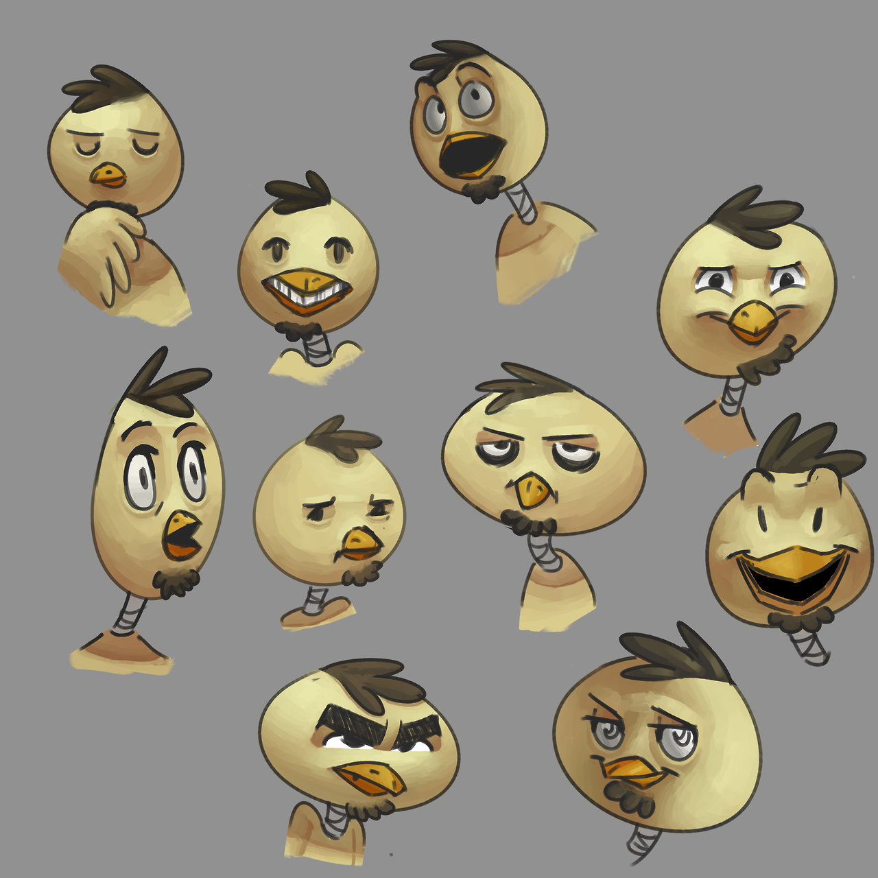
I started of by drawing the characters, Some of the proportion are a bit of but I tried my best to get it right.

I colored in the sketch making a silhouettes which is separated by color

So with that I could select a plains and add the details in.
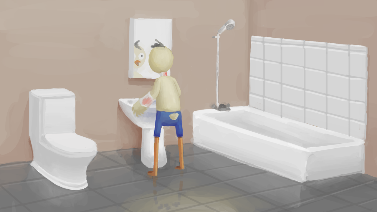
I decided to put in more effort to the background but as you can teal by metal railings but the sky behind it is lacking in details.
I then added a Gaussian to the background.
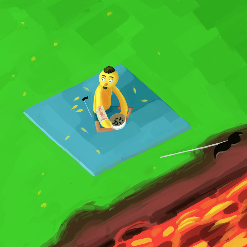
I made this scene to portrait a lot more information than the previous art works, like why is he shedding his feather, who or what is he looking at, whats up with the mustache and why is he seating next to the a river full of lava etc.

The reason I did this was to mimic Vis Dev artist works, and accomplish that I ended up creating a character for that purpose (its name is bip). Because my strong suit doesn’t lie that much with background art and as a Vis Dev artist you kind of need to know how to draw or paint a good background, that way you could properly covey an idea.
Mine compare to Goro’s looks diluted when it comes to color and background information.
For example this giant snake piece, I wanted to convey how big the snake was, and I think I pulled it off but once it came to bips area other than him and the horse it still looked really plain. maybe if i added trees there or something to make it a little busy maybe it wouldn’t look so plain.

I lost some of the screenshots but its basically similar to the fist post


Original

My color thingy
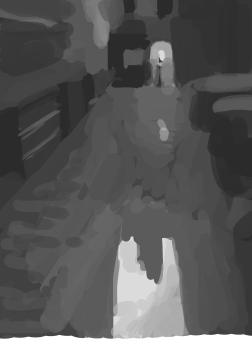

I started this off by just messily adding grays to what matches the original painting, so if there is a light gray at an area of the canvas then I would add it there. its around this part were I try to render each one/ area one by one. For example the bins around the sides.


Once I was done with the sides I tried to fixing the building at the back.
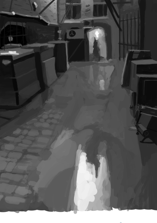 Final
Final
Doing this was a bit of a challenge for me, painting backgrounds isn’t really something I do.
